To A t
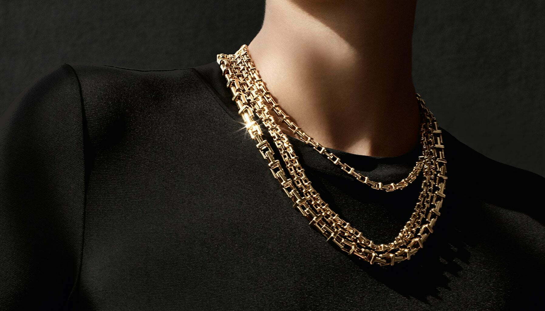
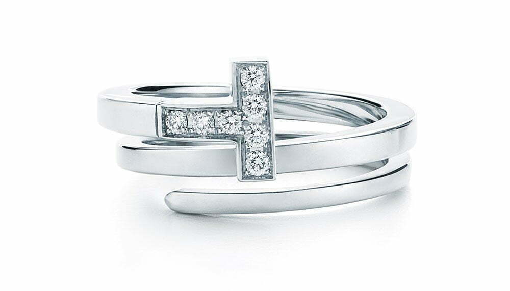
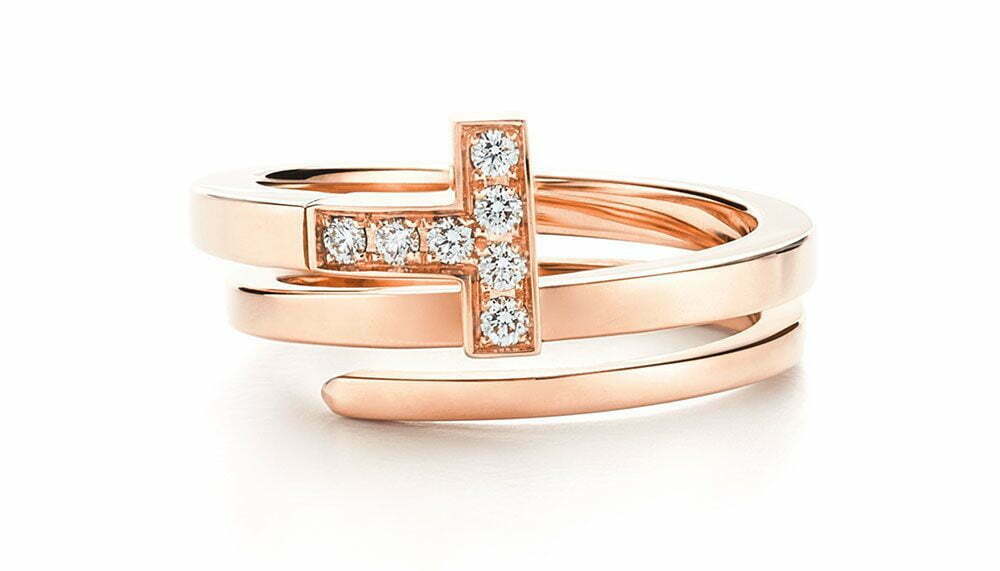
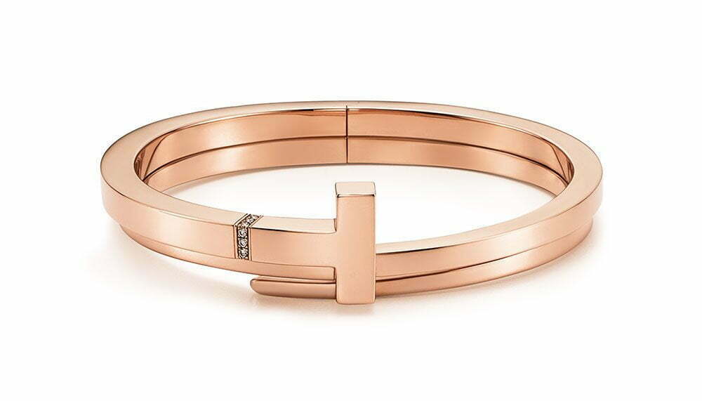
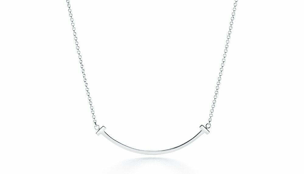
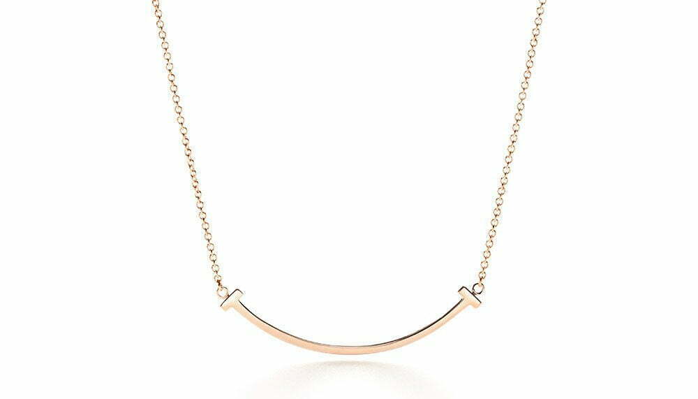
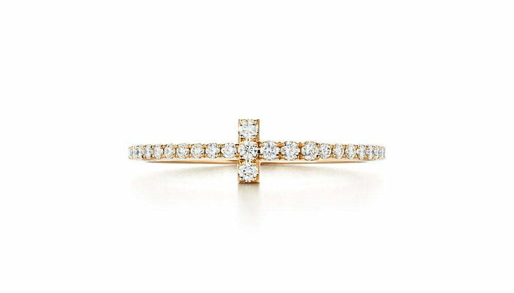
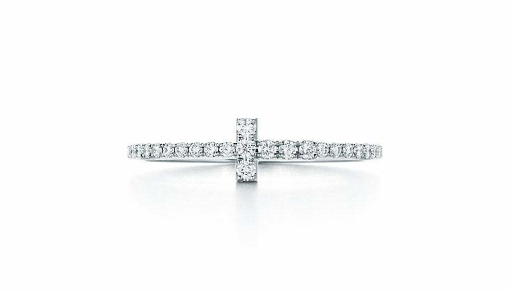
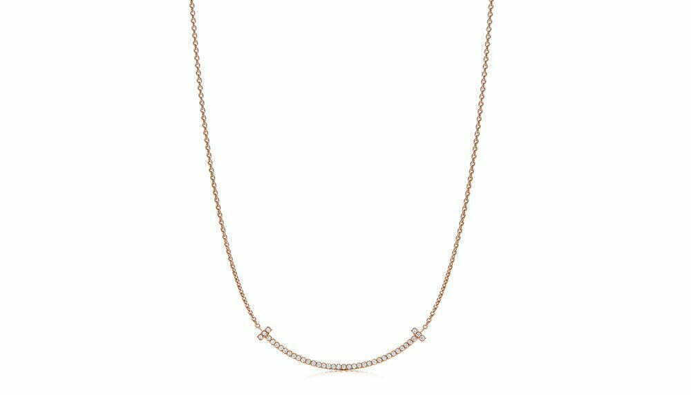
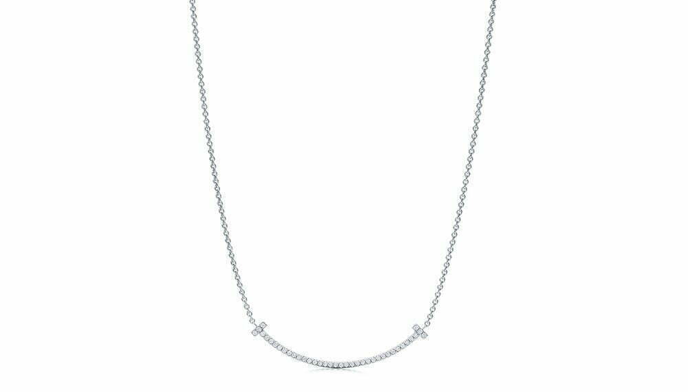
It appears so simple one wonders why it wasn’t created before 2013: working the letter T into structural elements of the jewellery, so the letter becomes a building block for design. This was the fundamental idea behind Tiffany T, the inaugural collection introduced three years ago by Tiffany & Co’s then-new design director Francesca Amfitheatrof.
The simplicity is deceptive, however. The collection is a perfect epitome of how less really is more, but to stop at “less" and resist the tendency to do “more" requires restraint, which Amfitheatrof has displayed impressively. The result is a collection marked by clean lines and an elegant, modern aesthetic. Now into its third year, the collection has grown to include a subtle injection of colour in the form of small blue sapphires and textural layers with unique wrap rings.

